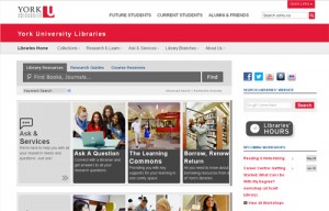
June 4, 2014 - On June 4th, York University Libraries launches a bold new website that will transform how students and faculty members find scholarly information and conduct their research.
Visitors of the website will notice innovative approaches were taken to create a more user-friendly, intuitive online experience. The website’s architecture has been re-developed and all content can now be found within five new categories: Collections, Research & Learn, Ask & Services, Library Branches and About Us. The catalogue search bar is also anchored at the top of each webpage, so users have quick access to search the catalogue from anywhere on the website.
 “Our primary focus was the student. The challenge we faced was how to convey to them that the library is more than just a place to look for information – it is also a place to ask questions, and learn to conduct library research,” explains University Librarian, Cynthia Archer. “After talking to students, the consultants we worked with proposed a series of visually representative quick-links – or “doors” – that could give students all three of those experiences on the website, while still offering the different library branches flexibility to highlight their special services.”
Faculty members and graduate students will also find sections of the website dedicated to their teaching, research and publishing needs.
The Libraries implemented Marketing & Creative Services and University Information Technology groups’ new responsive web template, which is designed to respond and adapt to any screen size.
“People access the web from such a variety of devices these days and it was important that our website be accessible from any of them,” explains Mark Robertson, associate university librarian, information services. “We have ensured that students, faculty and staff have access to critical information and tools from any way they choose. Our patrons can now find anything from research guides, to Libraries’ hours of operation, or search for a specific journal article, from a computer, tablet or mobile device.”
The Libraries worked with the marketing and communications agency H2 Central on the design and information architecture of the website, and Library Computing Services for the implementation.
To ensure York University Libraries was achieving benchmark standards determined by their patrons, feedback was collected throughout the year via individual consultations and usability and heuristic testing.
“I was highly impressed with the new look and usability of the Libraries’ redesigned website,” explained Navita Singh, a fourth-year psychology major, and participant in the website usability studies. “Everything the busy undergrad wants to find is right at their fingertips, in a much more visually appealing way. I encourage my fellow undergrads to explore the site and its features as much as possible – particularly the ‘Places to Study’ webpage.”
Use the York University Libraries website or provide feedback.
